HomeToGo
The World’s Largest Selection Of Vacation rentals
The Client
HomeToGo is the marketplace with the world’s largest selection of vacation rentals, listing offers from thousands of trusted partners, including Booking.com, Vrbo and TripAdvisor.
HomeToGo combines price, destination, dates and amenities to find the perfect accommodation for any trip worldwide.
Project Brief
For our final project, we collaborated with a real client on a digital product to see how we can improve and add value to their business by brainstorming solutions for their problems.
Overview :The challenge of this project was to collaborate with a real client and understand the business goals and values and align them with real user needs while considering our client’s technical or business constraints.
Timeline : 2 weeks
Team : Anju Chaudhary | Vandana Venugopal | Shekoofeh shahabi
Stakeholder : HomeToGo
Deliverables : Desktop
Tools : Figma, Reaction card, what font
Research & Analysis
Stakeholder Interview
After a bit of research of the company we had a stakeholder interview in which we wanted to learn as much as possible about the business. We asked him questions about
The Company & its Values
Value proposition
Pain points for current website/ blockers
Future Business goals
Ideal user experience
Client’s Main Needs
“We want to capture the intent of the user to display the most relevant results”
“Would like the website to be more interactive, organized and easy to navigate”
“The homepage needs to have good motivational stories”
“Encourage the user to select dates in the search page in order to better customize the results”
“Redesign the calendar in order to be more intuitive”
Competitive Analysis
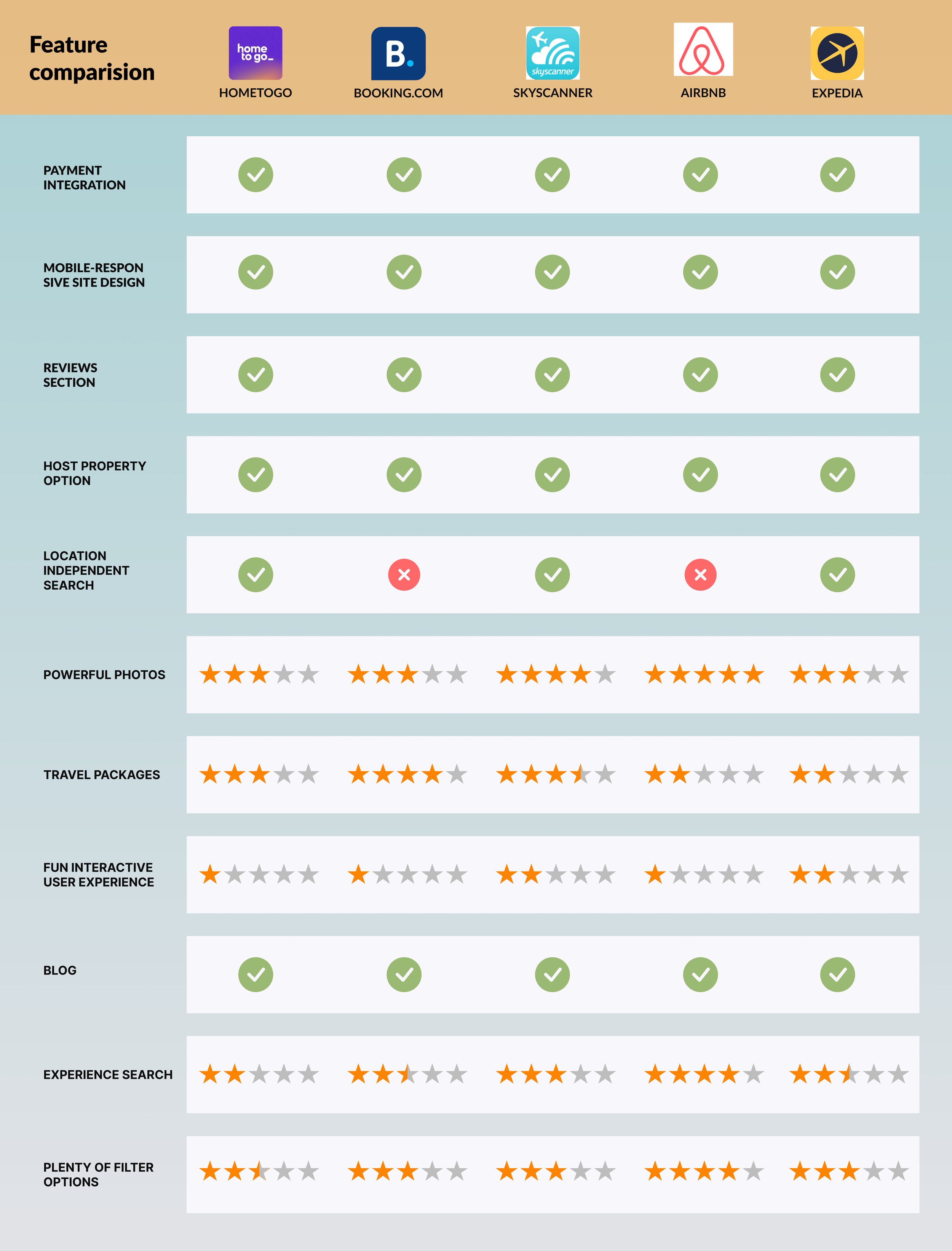
We first wanted to know what’s happening in the market to identify opportunities did some secondary research and looked at our main competitors from the current market position and the future market position. We then conducted a Feature comparison & Market positioning map.
Feature Analysis
We discovered all the competitors have different ranges of powerful photos, travel packages, experience search and more however most of them were missing mainly on fun interactive user experience. We considered that as a must for HomeToGo desktop design.
Market Positioning Map
We decided to create the market positioning map to understand our product location based on specific qualities in the market. By making the axis “Visually heavy — minimalistic design” and “Fun interactive user experience — less interactive approach”, we could identify the gap in the market.
User Research
Qualitative Research
To get the results based on qualitative research, we interviewed 5 users fit our user profile. We asked them questions such as below,
How they plan their vacations.
Which websites they use to book accommodations for the trip and why?
Pain points they face when navigating these websites.
A walkthrough of HomeToGo website in order to get their impression about the website.
Features they wished they could have on those apps and more questions related to Why? What? How?
We got qualitative responses such as;
“I find home page to be very long”
“I find it bit confusing information on Home page”
“The landing page doesn’t shows the website values”
“Calendar is not very clear”
Quantitative Research
For quantitative research we conducted survey consisting of 10 questions where we would find some interesting insights that would help us in working on the user interview .We got feedback from around 50 people .
What users like about their ideal travel accommodation website:
“Intuitive”
“Visually pleasing and easy to use”
“Recommendations for destinations”
“Good deals”
“Accurate reviews and genuine pictures”
Data Analysis
We gathered all the data from stakeholder’s interview, surveys and user interviews in order to find similarities and to compare the pain points with the help of a Affinity Diagram.
After Affinity mapping and dot voting we managed to find patterns that are causing the main frustrations for users.
UX/UI Case Study
Definitions of the user and problem statement
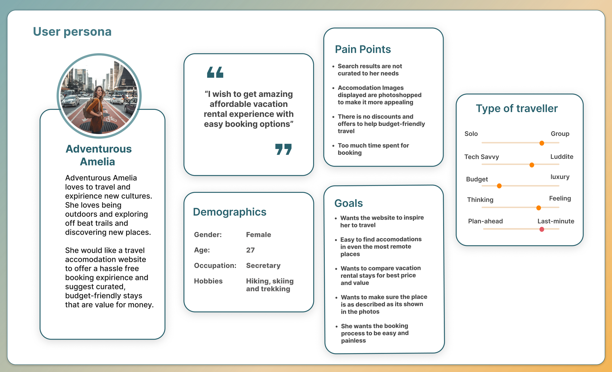
We created our user persona to capture pain points and to have a point of reference against which we would design our app.
User Persona
From all the gathered information, we created our Primary persona— Adventurous Amelia to imagine what an ideal customer would look like.
Amelia’s Pain points are:
Search results are not curated to her needs
Accommodation Images displayed are photoshopped to make it more appealing
There is no discounts and offers to help budget-friendly travel
Too much time spent for booking
Amelia’s goals are:
Wants the website to inspire her to travel
Easy to find accommodations in even the most remote places
Wants to compare vacation rental stays for best price and value
Wants to make sure the place is as described as its shown in the photos
-She wants the booking process to be easy and painless
User Journey
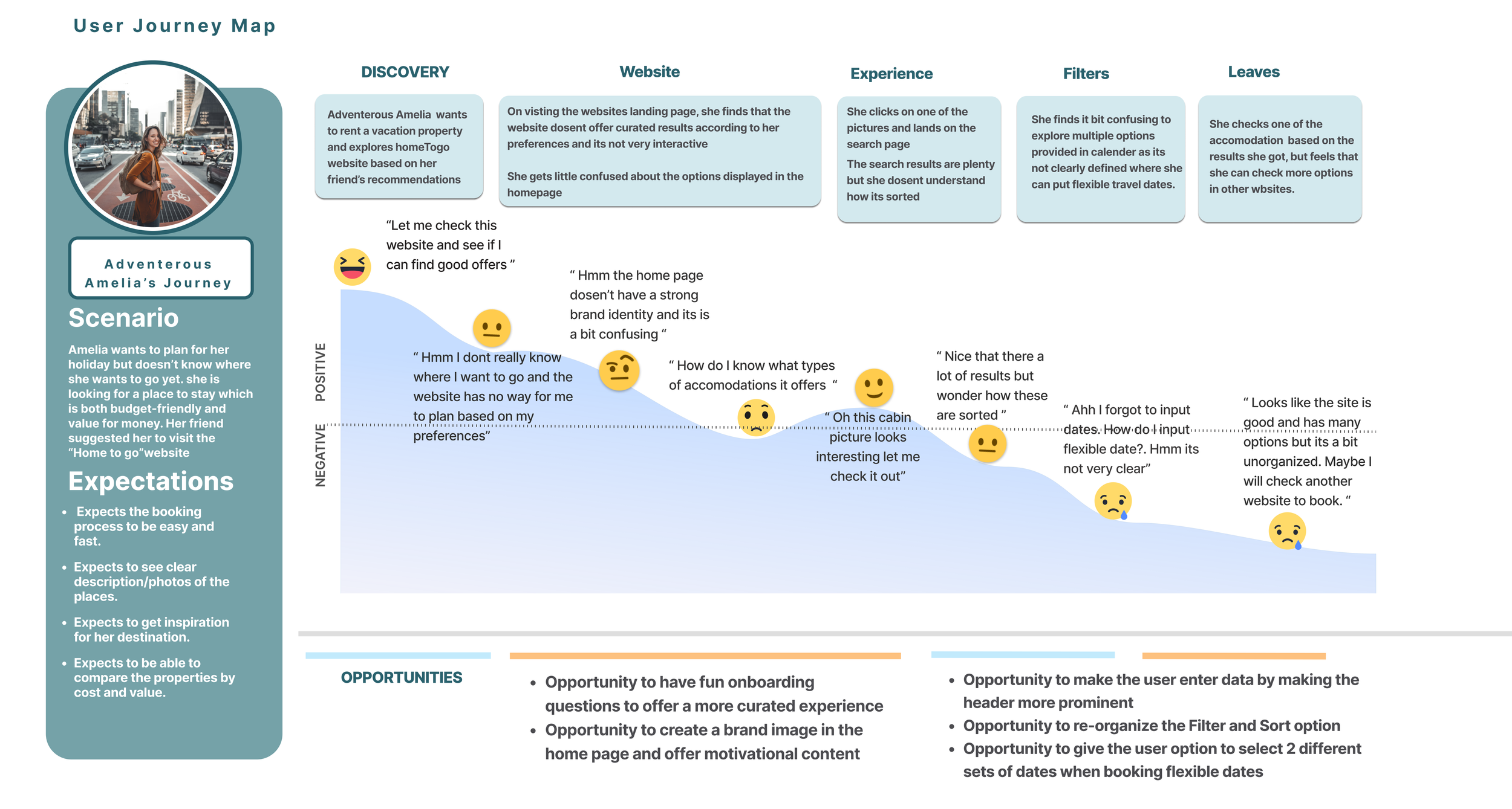
Adventurous Amelia wants to plan for her holiday but doesn’t know where she wants to go yet. She is looking for a place to stay which is both budget friendly and value for money. Her friend suggests her to visit the “HomeToGo” website.
During Amelia’s Journey, we have spotted some opportunities:
Help her by creating fun onboarding questions for more curated experience.
Create a brand image in the homepage & offer motivational content
Offer the option for user to enter data by making the header more prominent
Providing user option to select 2 different date selection criteria when booking flexible dates.
Problem Statement
Ideation of the solution
MoSCoW Method
For the ideation stage, we focused our efforts on ideating individual features that could help our target users in any way. Then, we categorized the resulting features using the MoSCoW method to proritise the most import features.
Design process
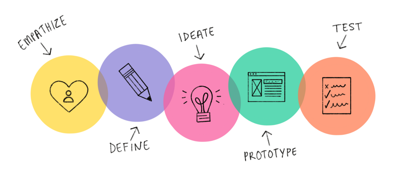
Empathize
Define
Ideate
Prototypes
Test
“Travelers need to find a way to enter their preference in the website regarding their dates, goals and their budget easily because they want to get more relevant results efficiently”
Prototypes
Low Fidelity Wireframes and Concept Testing
We generated some ideas using pen and paper. We then started by creating low fidelity wireframes for Amelia’s happy path.
Mid Fidelity Wireframes and Usability Testing
We iterated & incorporated the feedback from the concept testing with the lo-fi wireframes designing the mid-fidelity wireframes.
Desirability testing
After High-fidelity prototyping we did desirability testing with 3 users and got similar adjective responses as below, which were closer to our goals for this application.
Next steps
Calendar
Based on the User feedback , We would like to test and reiterate the calendar feature to make flexible dates more Clear and simple.
Points System
From our user feedback we know that a lot of people return to the same websites as each purchase gives them some points that they can use to get discounts.
Blog
Based on our survey results, we would like to add a blog feature to inspire the users and help them discover off-Beat tourist spots.
Conclusions and Takeaways
Having a company client allowed us to demonstrate how we read a brief, collaborate with stakeholders.
Balance business goals with market fit, while also taking into account user needs and pain points to gain a competitive advantage.
Understand not only what features to implement but also why the features needs to be implemented.
User Flow
We defined a user flow with Amelia’s happy path. First she Goes to homepage via organic google search, then she moves ahead with fun quiz interaction and lands up on recommendation page. Then from there she moves further to Search page- selects either specific dates, or flexible dates (choose non consecutive multiple months) and finds options based on that.
We did 5 interviews to test the low-fi wireframes to validate the idea and put the product in front of users to get feedback quickly. Also, we were in constant touch with stakeholder to get feedback on low-fi wireframes.
We got good insight to improve the lo-fi wireframes on the basis of feedbacks such as:
“Interactive fun quiz Trivia looks good however its way too crowded”
“CTA button for quiz looks too long”
“Sort and filter options can be more clear”
We conducted usability testing sessions with 5 users and also were constant touch with stakeholder to get feedback on mid -fi wireframes. We got feedbacks as below:
“Choose dates option looks good however we don’t use them that often”
“Sport and adventure options in fun quiz looks similar options”
“Stay Ratings options can be more clear”
For the rest, we got optimistic feedbacks and pointed that concept and features were easy to understand.
Designing the user interface:
Visual Competitive Analysis
We did visual competitive analysis with 3 other widely used Travel based competitors in the market.
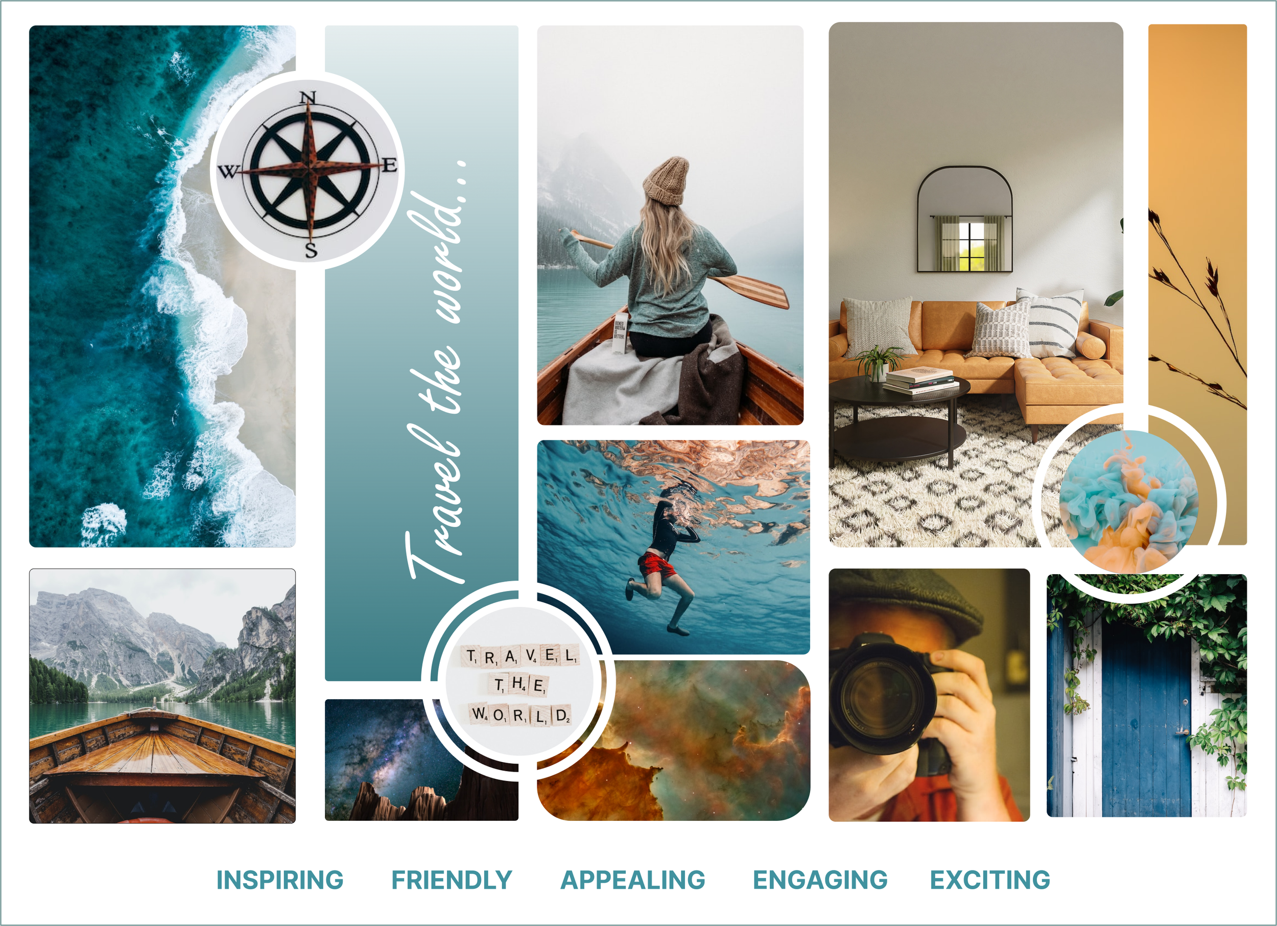
Brand Attributes & Mood board
To define our brand attributes, we chose 5 adjectives to identify the character and personality traits of the brand:
Inspiring
Friendly
Appealing
Engaging
Exciting
Based on these finalized Brand attributes, we then created our mood board with the calm blue color shades and Orange shades.
We tested our mood board with different users asking them to write down 4–5 adjectives that came to their mind when looking at the mood board. They were mostly inline with the above finalized mood board brand attributes.
Style Guide
Through Atomic design we created our style guide which included fonts, colors, logos, buttons and other elements.
High-fidelity prototype & Desirability testing
Here’s a short video of the High-fi prototype that shows Amelia’s happy path with easy flow.
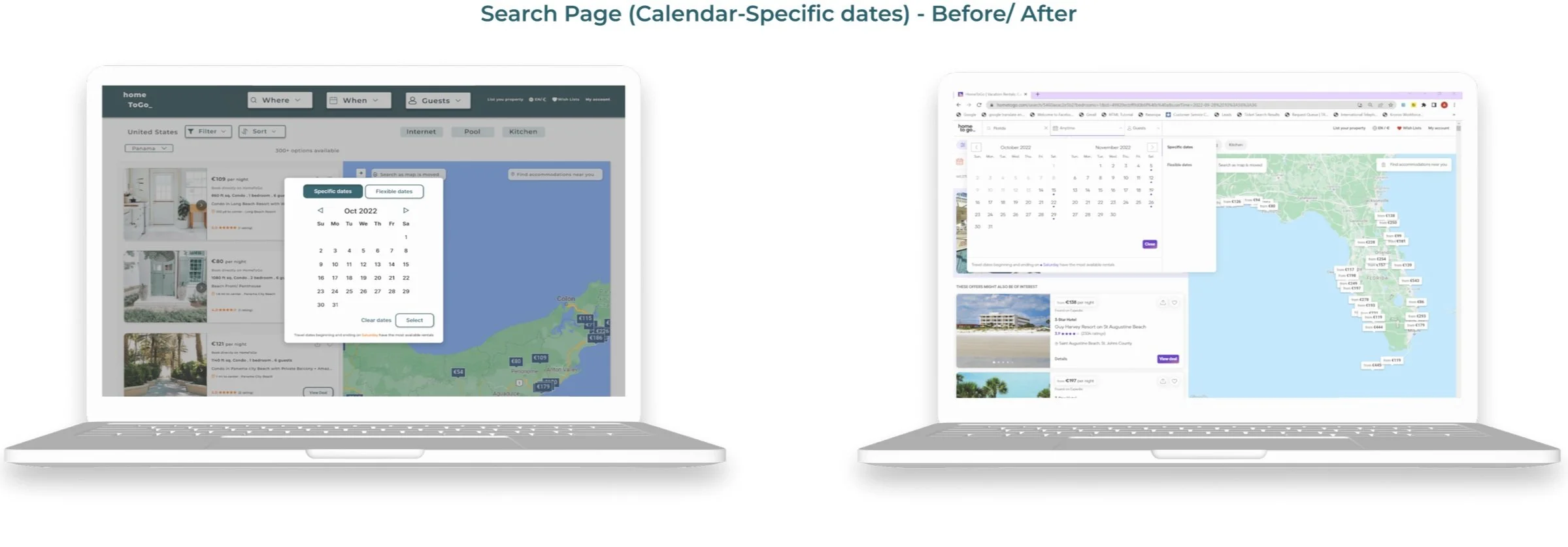
Re-design
We then compared the home screen and Search screen evolution as an example to show case the evolution from low-fi, mid-fi to high-fi prototyping as below:
