LUNA
Period Tracking Application
Why Period tracking app?
Why a Period tracking app?
The Challenge
We chose to work on Period tracking application because we wanted to create something not only helpful but meaningful for all those people who menstruate.
We chose to work on Period tracking application because we wanted to create something not only helpful but meaningful for all those people who menstruate.
Deliverables
User research and analysis : Competitive analysis, quantitative and qualitative research
Design : User Journey map, User persona, problem statement
Prototype and test : Low-fi and Mid-fi and Hi-fi prototype, Concept sketch, Concept test, usability test and desirability test
Overview : The fourth project challenge in Ironhack was to design a wellness app to rethink how people can adopt and commit to a health-improving routine and to explore technology can be used to help people live healthier lives.
Objective : The challenge was to choose an area of wellness to work and deliver an app that is useful in improving the users health. We chose to work on Period tracking application for this project
Duration : 2 weeks
Teams : Vandana & Myself
Target Platform : Android
Tools : Figma, Reaction card, Material.io
Empathize
Competitive Analysis
Feature Analysis
Brand Analysis
Market Positioning Map
User Research
Qualitative research : To get the results based on qualitative research, we interviewed 5 users fit our user profile.
We got qualitative responses such as :
“ I want pop-ups to offer suggestions to input how I am feeling when i log my period ”
“ Health concern prediction based on cycle data ”
“ I am not comfortable with my data being used ”
Quantitative research : To get the results based on qualitative research, we used Google forms and shared the survey to users who fit our user profile. we got about 70 responses.
We then combined both the responses and created Affinity map and on the basis of dot voting, we finalized users main responses as below:
Reminder/Notification
PMS symptoms
Mood tracking
Simple UI for tracking period/Less clickthrough's
ovulation and fertility chart
Nutrition advice/remedies
Data Privacy
User Persona
UI Case Study
Anxious Anna is our user persona. She is 27 years, female, business owner. Most of the time she forgets her period cycle and to calculate ovulation. She wants a simple period tracking app with regular notifications and manage health related issues.
She struggles to get any good period based apps in the market with content on dealing with health related issues such as PCOD/PMS. Few of goals are to get period app providing nutrition advice. Also, data privacy and easy to use app.
User Journey
Scenario : Anxious Anna has missed her periods and wants to track her cycle. After her friend’s advice, she starts using a period based app.
She then starts using the app and gets overwhelmed with too much information. Also, she couldn’t find any health advice section/ or forum page for questions. She doesn’t gets any reminder about her period’s due date. She then checks out the features however unable to input her moods during cycle and also there is no option to book doctor’s appointment.
Since, there are not enough period based apps in the market, she ends up using the same.
On the basis of Moscow’s method, we decided to prioritize the following features:
To have notifications options for regular reminders
To have symptoms page so that she can input her moods/PMS
Dash board to show her period cycle data through months/years
Forum to ask questions
health advice section to get any information related to health
data privacy information
User Flow
Concept Sketching and Testing
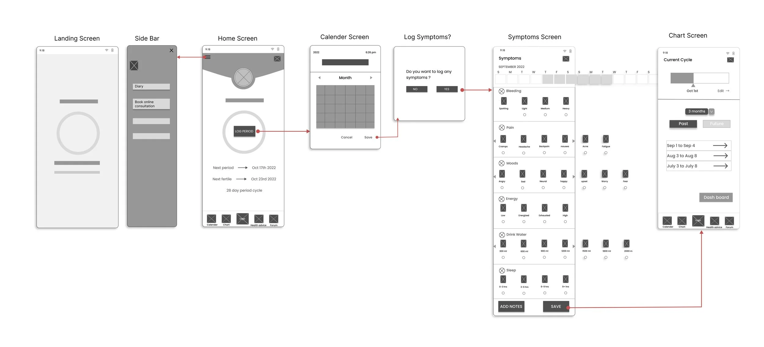
With the help of user flow we started sketching the screens. We did 5 interviews to test the sketches to validate the idea and put the product in front of users to get feedback quickly. We got good insight to improve the product on the basis of feedbacks
Mid-Fidelity Wireframes and Usability testing
We conducted usability testing sessions of 5 users and got feedbacks as below:
“Instead of radio button in symptoms page, option of selecting icons directly should be used”
“Instead of read buttons in health advice page, usage of arrows would look more neat”
“User flow is easy to understand and looks neat”
With all the feedback gathered during the usability testing, we decided to apply these changes to the high-fidelity prototypes to improve its usability.
Mood board and Style tile
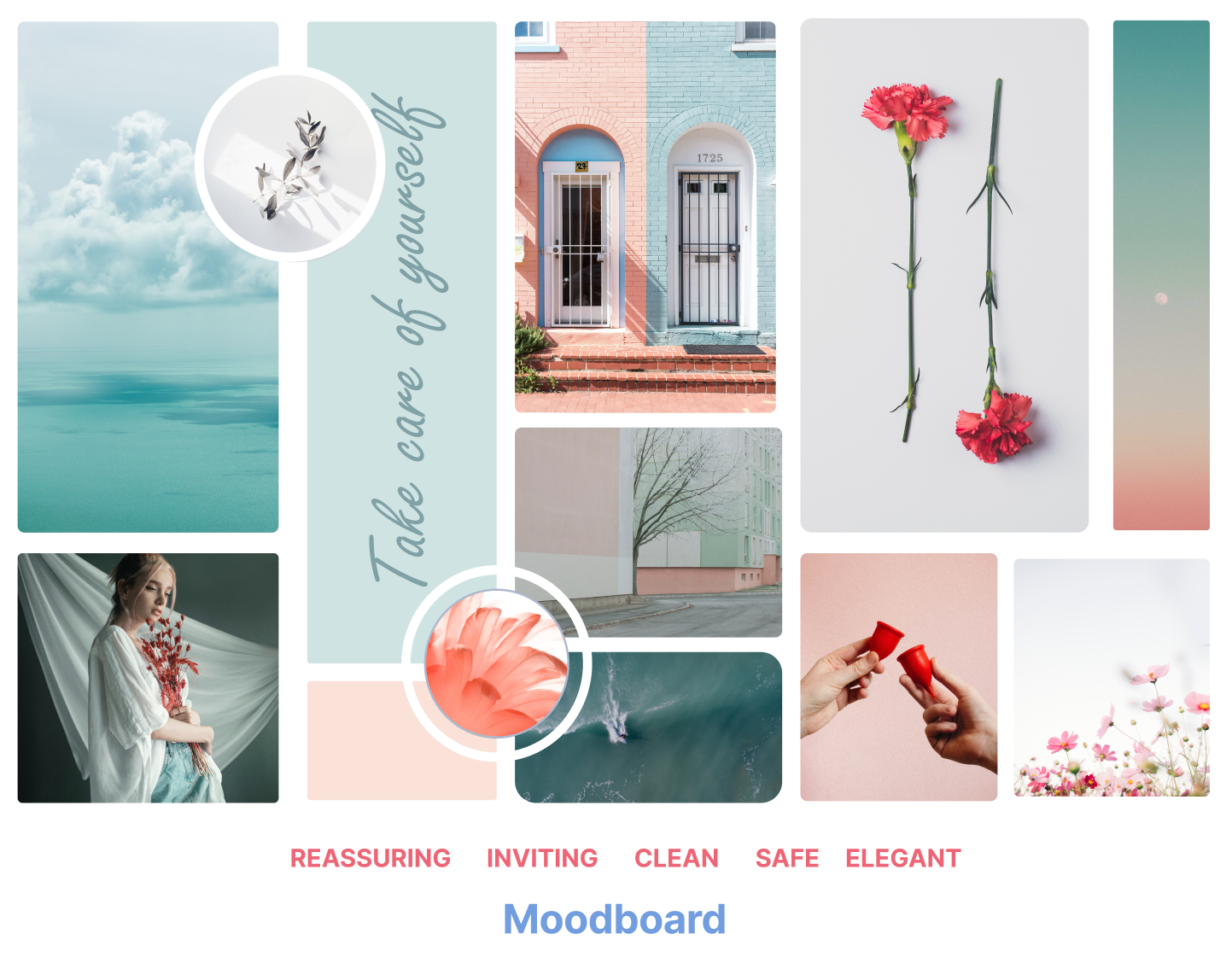
To define our brand attributes, we chose 5 adjectives to identify the character and personality traits of the brand. Based on these finalized Brand attributes, we then created our mood board with the calm blue color shades and pink shades of feminism.
High- Fidelity Prototype and Desirability testing
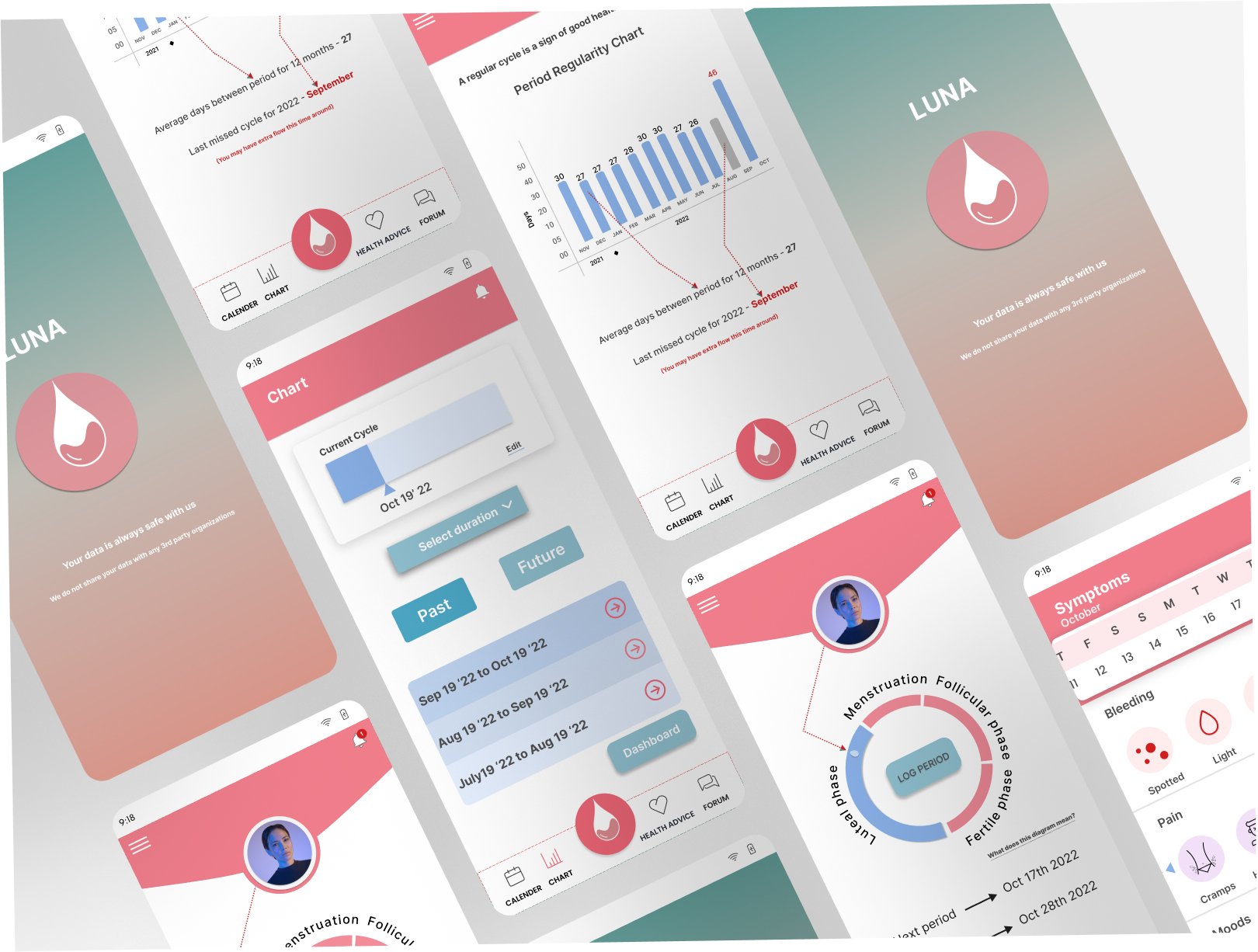
We designed the high-fidelity prototype for an Android large below:
After High-fidelity prototyping we did desirability testing with 3 users and got similar adjective responses, which were closer to our goals for this application - clean, helpful, sophisticated, easy to use, simplistic
Evolution
We gained understanding in providing helpful information and clean design by finding balance between the visual quality and user needs.
Always team work is very important to achieve good end results.
Conduct usability test with the high-fidelity prototype to refine the feedbacks and test the iterations.
Implement new features apart from happy path


